Petition ruffles city's expectations
Last-minute public outcry over the suggested change to the city's current sternwheeler has Coun. Ranj Pillai suggesting the city should hold off on adopting a new logo and tagline.
By Stephanie Waddell on April 5, 2011
Last-minute public outcry over the suggested change to the city's current sternwheeler has Coun. Ranj Pillai suggesting the city should hold off on adopting a new logo and tagline.
At its meeting Monday evening, city council was presented with an 845-signature petition calling on the city to keep the sternwheeler as its logo.
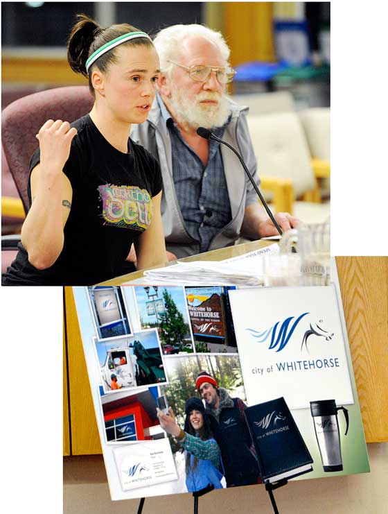
Before the presentation, council heard a recommendation from staff that it move ahead with a bylaw to change the city's logo to that of a white horse with the tagline "Above All Expectations”.
The recommendation comes after a process began last fall with a $50,000 grant from the Yukon government and another $10,000 of the city's cash.
The city hired eSolutions of Waterloo, Ont. to produce a new brand in response to requests from the business community.
After 681 people responded to a survey about Whitehorse, eSolutions came up with a number of options, narrowing them down to three which were presented to the community.
None used the sternwheeler, Coun. Doug Graham pointed out last night.
Faced with the three options, a majority (67 per cent) of the 54 who filled out comments at the public meeting supported the new white horse logo and 54 per cent supported the "Above All Expectations” tagline to go with it.
City spokesman Matthew Grant told council last night the sternwheeler was not part of the options brought forward because of an early survey showing many don't believe the sternwheeler captures the right image for the city.
The survey, completed by 681 residents either on-line or by writing, found just 4.83 per cent "strongly agreed” the sternwheeler was the right image for the city.
Another 19.69 per cent agreed, 32.82 were neutral in their reaction, 31.08 per cent disagreed and 11.78 per cent strongly disagreed.
Graham wasn't buying Grant's argument Monday night, as he pointed out less than 50 per cent disagreed with the sternwheeler image.
Residents were faced with choosing from among three images, none of which featured the boats that once plied Yukon waterways .
"We didn't give people the option,” Graham said.
As he spoke, Vanessa Brault, who led the petition campaign, could be seen in the gallery nodding her head in agreement.
She had done the same earlier when Coun. Betty Irwin recalled the trouble she had with the project from the start in hiring a consultant from Outside to figure out how residents feel about the city.
Coun. Dave Austin countered a request for proposals was released with only one proposal submitted locally that was out of the project's budget.
Irwin compared being given the three options to choose from to being given the choice of how someone would want to be executed.
She suggested that given the backlash in the community, the city should get it right before it adopts a new brand.
Irwin also suggested the sternwheeler, adopted as a city logo in the 1970s, could be modernized.
Like Irwin, Pillai stressed the importance of having the branding done right to ensure there's buy-in from the community.
Suggesting the project had gotten somewhat "skewed” along the way, he said what the business community had been looking for was something it could integrate and have at the ready for those wondering about the city.
The business community never said anything about having a uniform, internal design, he said.
Pallai said he understands the frustration among other council members that residents are now coming forward at the 11th hour to speak out against losing the sternwheeler.
However, it's important to listen, he said. He suggested deferring the project and perhaps asking residents for their preference between the white horse or the sternwheeler as a logo.
Coun. Dave Stockdale also had some issues with the branding, though it had little to do with the concept being selected.
Rather, he said, he had been left with the impression that whatever was chosen would be for materials going to people outside the city, and not a complete overhaul of city truck logos, signs and so on.
Other members of council, however, argued residents had enough time and public input opportunities between the early survey and the public meeting on the three proposals.
At some point, it's important to get on with it, Austin said, and council members who aren't in favour of the proposal can vote it down.
"Council has to make a decision,” said Mayor Bev Buckway said.
Coun. Florence Roberts, meanwhile, argued that as an "ad gimmick”, the white horse symbol is "pretty wonderful”.
It wasn't until after the council discussion that Brault came forward with her petition, arguing she hadn't meant to frustrate council, but has found many people are unaware of the branding project.
As she informs people of the situation, many tell her,"Thank you, Vanessa,” she said.
In an earlier presentation to council, she wondered whether there was a need for a branding change, argueing the sternwheeler is unique to the city and what the community was built on.
In six days, Brault managed to find 845 people willing to state the same through the petition.
"This has consumed me for a week,” she said.
Joining Brault at the table was Dan Burke, who told council he and a number of other seniors who don't use the Internet were unaware of the branding initiative.
There was also advertising done through media and at the Canada Games Centre, with media coverage of the issue as well. Burke didn't come across those sources of information, except for a short mention in a newspaper he said he didn't understand.
"We don't want it changed,” Burke said of the logo.
Seniors make up 30 per cent of the territory, he added, and surveys like the earlier branding questionnaire should be brought to voters so they can have a say on such issues.
Council will vote next week on whether to move forward with the bylaw to adopt the new brand.
If it does go ahead, this city wouldn't be the only community to have a white horse for its logo.
A quick look at the website for Whitehorse, Victoria in Australia shows a side view of the animal, appearing similar to a chess piece and surrounded by a rectangle of black.
The local white horse logo would feature more of a detailed head with a blue wavy "W” for a mane.
Implementing the brand – changing the decals on trucks, ordering new stationary and so on – would be done in phases over two years, costing approximately $10,000 each year.
The city still has $10,000 left from the project it could spend on implementation for this year, Grant told reporters Monday.
Comments (15)
Up 0 Down 0
Yukoner on Apr 14, 2011 at 9:01 am
Born and raised Yukoner, and I say the logo SUCKS. Why did it need changing? The money invested in this superficial change could have been better spent.
If you don't agree with me about his particular issue, you are aren't a true Yukoner.
Up 0 Down 0
too late...still on Apr 14, 2011 at 7:30 am
PS - I have been here my whole life - more than 40 years - and have never lived in Toronto. Ergo, I do not understand why supporting a new logo would make me a Torontonian or a hippie.
The money is already spent, the consultaion was done. Move on. Besides - the white horse rapids (for which the city is named) will outlive the sternwheeler by a longshot, and they are real, natural and not man made.
Up 0 Down 0
J. Malone on Apr 14, 2011 at 6:38 am
It is not very often that I agree with Francias but we agree on this issue. My god, that new logo is terrible. It completely misses the mark about Whitehorse. I was born in Whitehorse more than 40 years ago and I don't think that I have ever seen a "white horse" around here! Give me a break, I don't have any problems with the paddlewheeler logo but if we need a new logo (for whatever reason), let's find a logo that has significance to Whitehorse! What a waste of money! Why is the COW and YTG blowing money on this goofy initiative - I don't mind paying more property taxes for our municipal services (I paid more than $3,200 last year) - but this is difficult to take!
Up 0 Down 0
Jason McArthur on Apr 14, 2011 at 1:35 am
I would contend that there are a far more than 1000 people who oppose this measure. With the ever increasing amount of property tax and cost of utilities experienced by Whitehorse residents, beyond attachment to the old logo that a portion of the citizenry rightly have, the new logo seems like yet another expense to throw on the taxpayer. The mayor and certain (too)longstanding members of the city counsel in many recent decisions seem like the voices and input of residents is merely annoying white noise that distracts from their busy jobs of being "deciders." I would remind them that they are elected public SERVANTS, in place to serve the good of the community and not collect political feathers in their caps. When the mayor and true believers among the city council who want this new logo so badly take pay cuts to show their dedication to it, then maybe I'll see this as something more than a frivolous use of public money. Thank heaven for Ranj Pillai!
Up 0 Down 0
Framcias pillman on Apr 12, 2011 at 1:13 pm
Get into the 21st century? What are you talking about. The new logo sucks. Again, stop trying to change this place so it feels more like Toronto. No one wants your hippie ideas.
Up 0 Down 0
mark on Apr 12, 2011 at 5:57 am
Too late, I agree. It is time Whitehorse, and its citizens get into the 21st century. The logo looks great, why lets 1000 or less people spoil it for the rest of us who want the change
Up 0 Down 0
Carla Hills on Apr 11, 2011 at 8:46 am
That logo would better fit Calgary. A white horse to stand for the city of Whitehorse...how original?
The Sternwheeler is far more representative of what I know of the city and is far more unique. Why did they not just update the boat?!
Up 0 Down 0
L.Jonasson on Apr 10, 2011 at 5:22 am
The horse looks like a trendy bad tattoo we are going to want it gone and "above all expectations"...I put a question mark after that statement...lame.
Near 30 years here, this logo does not represent a darn thing to me except a bad choice... and like a friend once said "you never get anywhere trying to ride a dead horse"
Up 0 Down 0
Steve E on Apr 7, 2011 at 7:56 am
A department in government and or high priced consultants must justify their existence, therefore up pops the logo fiasco. This same mentality is being applied all over the Yukon because someone or some minor think tank needs a pay cheque to keep coming from taxpayers. I'd prefer they get laid off like the rest of us in the real world, instead of burning up vital resources to somehow prove they are essential and productive. The day of reckoning is coming for all the needless bureaucracy and flim flam movers and shakers.
Up 0 Down 0
Piper on Apr 7, 2011 at 5:42 am
Patrick,
That comment feels like people with heartfelt contributions to make to an exercise that has to do with identity, are being compared to things that come out of the "woodwork".
This shouldn't be about winners and losers. Or people who handed their homework in "on time" vs. people who took longer to contribute more substance.
Especially on an exercise that has to do with identity, and heritage. Six years perhaps hasn't been long enough for heritage to resonate with you. But maybe you can respect that it does with other people.
Anyway it seems to me that Vanessa has brought some things to light about some flaws in the consultation process that many other people appreciated. I don't see the downside to that.
Consultation and dialogue isn't actually the private domain of the City of Whitehorse.
Up 0 Down 0
Patrick Matheson on Apr 6, 2011 at 10:26 am
One never knows what will come out of the woodwork...
I was informed of the Branding Project by reading the local printed papers and their websites. I saw a number of ads that provided me with the ways and means to participate in this public project. The questions were provided on line and asked the reader a number of questions re: logos and images, what I thought Whitehorse meant to me and what words I would use to describe this area. Some existing logos' were shown and we were asked 'what is this?' (Anchorage has a pretty bad logo)
I was also informed of the intent of the project and the reasons behind the work.
A number of weeks later and again, via the local papers, I was informed of an Open House. The open house would present some ideas, suggestions and works in progress. City managers and the design company was on hand to take questions. A questionnaire was provided for written feedback.
Personally (and after living here for 6 years) the Paddle wheeler logo is So-So. It suggests that this was once the main means of transportation but no more. Friends and visitors have asked me many times why the city is named Whitehorse. Of course this brings up some long explanations.
(For me, this area is about nature and the environment that surround the city limits, not about past transportation)
Oh well.
FYI. I voted for the horse, and I am not a hippie (nothing wrong with hippies)
Peace
Up 0 Down 0
too late on Apr 6, 2011 at 2:21 am
Pardon me, but last ditch efforts to influence the city's budget were ignored... why would you allow a project to be driven off the rails by naysayers that should have been paying attention in the first place?
We spend way too much time worrying about what seniors think and should not stay in the dark ages because they prefer Whitehorse to sell the image of a woodburning sternwheeler. It's still a tourist attraction - leave it at that and join the 21st century.
Up 0 Down 0
Bob Graham on Apr 6, 2011 at 1:33 am
What a great City Whitehorse is. I'm writing from Hamilton,Ontario and lived in the Army Base on top of the mountain 1956 to 1959. As a kid, went down the mountain to town often and we played for hours on the Sternwheelers dry docked beside the river! I'm sure they are long gone now but will forever live in my memory! The great City of Whitehorse must look much different than I remember but I'm sure the people are just as nice as when I lived there! Must say, my best memories of life are those spent in the Yukon! Keep the Sternwheelers as your logo, represents the beginning!
Up 0 Down 0
Murray Lundberg on Apr 5, 2011 at 11:47 pm
I had no idea that there was a "branding initiative" in the works, and I don't exactly live under a rock. While I wouldn't argue if a "modernized" sternwheeler logo was looked at, I question the huge cost that would be entailed in doing so - among the many other aspects of that change, how many vehicles would need to be re-logoed at a couple of hundred dollars each??? Whitehorse exists because of sternwheelers, and the SS Klondike is probably our most famous, internationally-recognized icon. The artsy thing that the Ontario company came up with says NOTHING about my home.
Up 0 Down 0
Francias pillman on Apr 5, 2011 at 9:07 am
Just because some hippies filled out the branding survey does not give them the right to choose anything. I'll put money on that this is the doing of non Yukoners from down south who are hell bent on wrecking everything up here. And BTW, that new logo SUCKS.